Artsy Stuff In Which I Indulge My Artistic Side
TL;DR
No release this week, I’ve been experimenting with art styles for the game and haven’t quite settled on anything yet.
Painfully Minimalistic
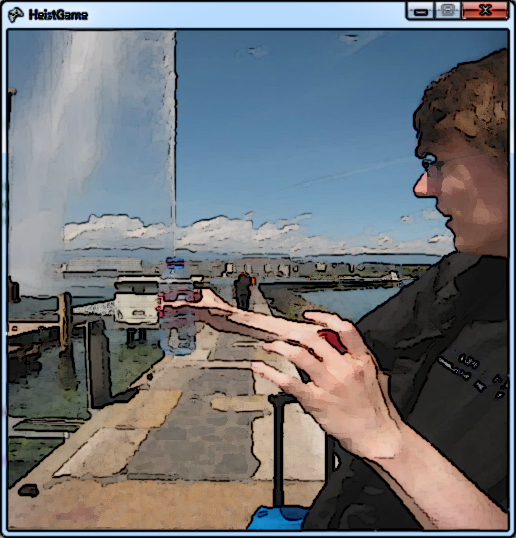
One thing a lot of people have said to me when trying Heist is that they loved the art style. To be honest, this came as quite a surprise to me, the style I had in Heist wasn’t a deliberate choice so much as throwing the first thing that looked reasonable on screen! If you’ve played the game, you’ll recognise this kind of thing:
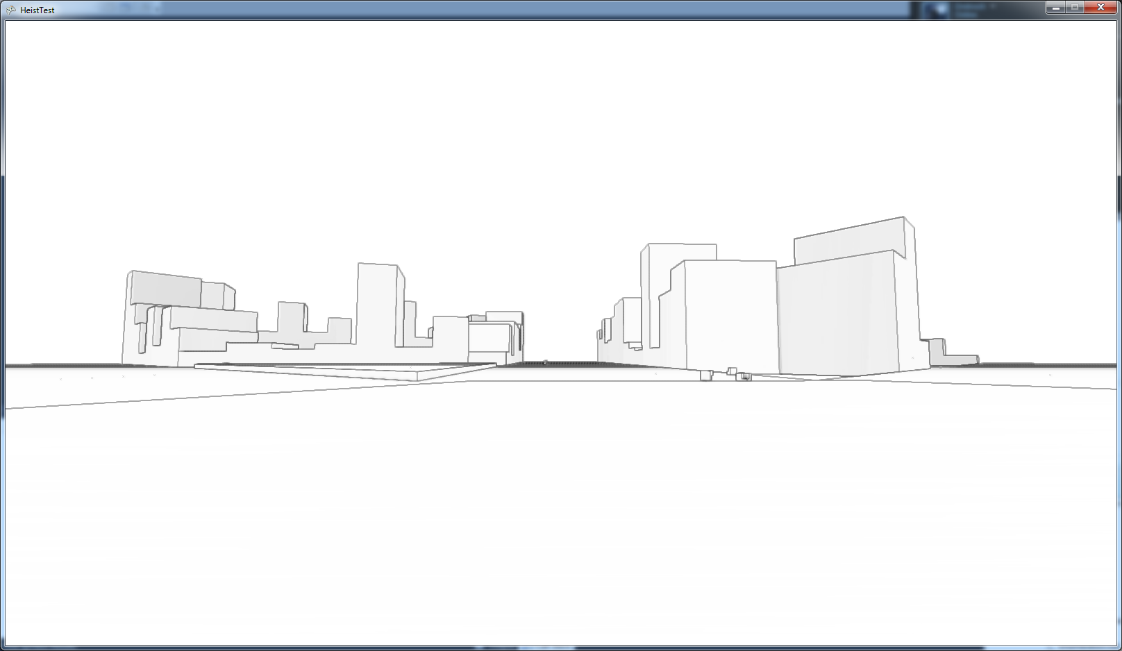
This week I’ve been playing with establishing a rendering system for the game, all the time I was working I tried to keep in mind that the end style should be something minmal. Why not just keep what I already had? Even though people like it, it just won’t scale up to a full game, long play sessions would start to get very boring in a plain white world like this.
An Unpleasant Texture
My first task with establishing a new rendering system was texturing, the old world was rendered like that because I didn’t know how to apply textures to my procedurally generated world. As it happens I haven’t finished this task completely yet and that’s party why I’m not making any release this week.
Textures are applied to a model by supply “texture coordinates” to each vertex in the model, these coordinates tell the graphics card which part of the texture to draw for each pixel on screen. Normally an artist will flatten out a model and calculate a texture coordinate map as part of the content creation process, the problem with this is my models are all procedurally generated! Luckily Heist doesn’t actually need such a detailed texture map, because of the minimal style I’m going to be going for textures will be quite subtle and suggestive of surface detail rather than containing a lot of actual detail - this allows me to sort of splat textures over models in any way and it’ll look ok. In the end I decided to use a trick inspired by the way quake generated texture coordinates for levels…
Texture Coordinates
A quick aside for a load of badly explained maths:
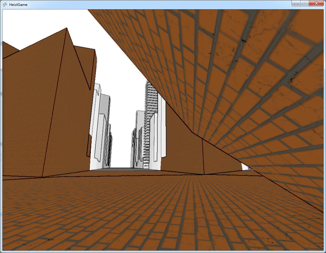
This trick from quake is actually pretty simple. Every vertex has a 3D position in space, and I want to convert this to a 2D position on a texture, essentially I have to decide which coordinate axis is the “least important” and drop that. First I take the Normal vector of the plane of the face this vertex is part of, since the normal points out from a flat plane clearly I want to paint the texture across the normal, but which orientation do I want? To decide on orientation I walk through all the edges of the face and pick the edge which is most closely aligned to a vector pointing directly west, this gives me an arbitrary alignment for textures, and textures on similarly aligned surfaces will tend to be roughly aligned with one another. Now that I have 2 vectors, one defining alignment and one defining orientation of the texture I can simply project the vertex positions on this plane and the coordinates drop right out! Using my test texture (rainbow coloured bricks), this got me something like this:
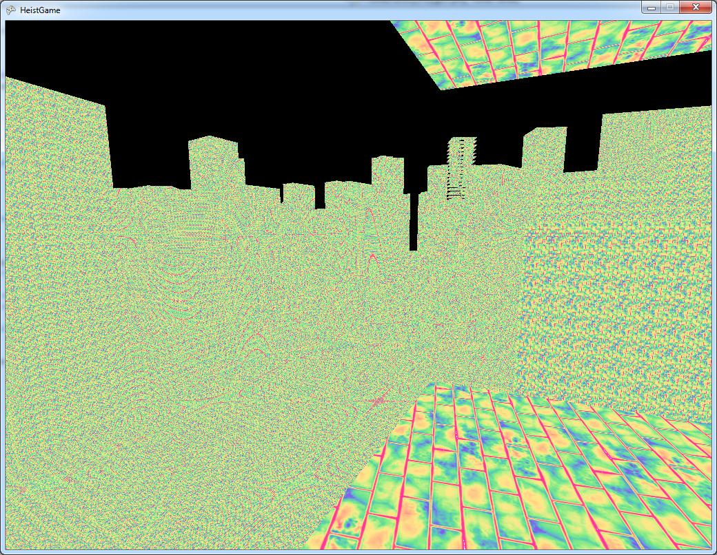
That Looks Terrible
Yes, it does. The texture fades into a horrible mess of random noise in the distance, this is texture aliasing caused by trying to draw a high resolution texture in just a few pixels (basically Nyquist says no). The solution to this problem is just to turn on mip maps, so as distance increases and we try to pack the texture into ever smaller areas of screen we actually draw a smaller (lower detail) version of the texture. This is a visualisation of the kind of effect this has:
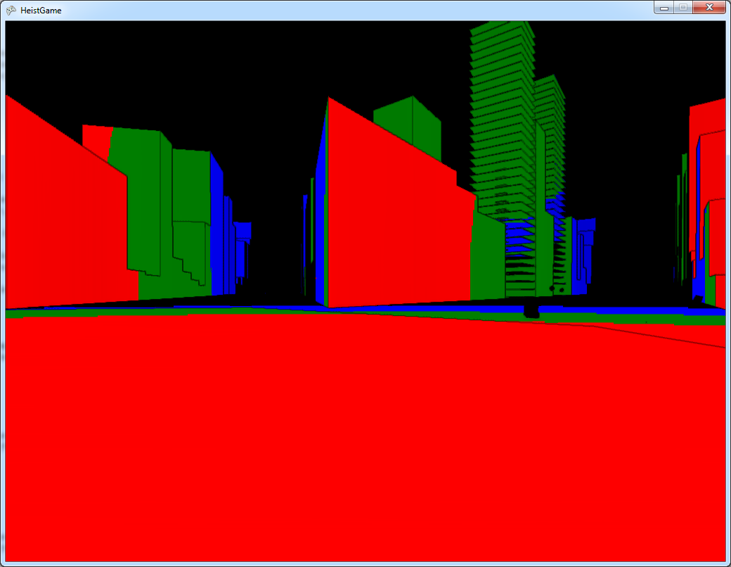
I’ve split the texture up into 3 parts: red is the high detail part, green is the medium detail part and blue is the low detail part. Multiplying by the original minimal style to get edges back again, we end up with something like this:
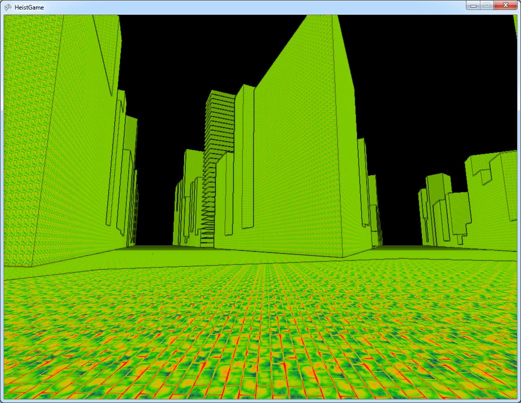
Much better, the textures fadeout to a flat colour in the distance instead of crowding in too much detail and looking ugly.
I’m Beginning To Hate Rainbows
I have to admit, I lied a bit earlier when I said that I was just painting a raindbow brick texture over the scene - this is actually two textures! The first texture is a grayscale heightmap which defines the shape of the bricks, the second is a rainbow. The texture mapping shader actually picks the colour from the second texture based on the height of the first (this is apparently called gradient mapping. This two step procedure is useful, because it allows various colour effects to be applied to the tiny little colour map and suddenly they’re applied to the entire scene, also if you want to change your bricks from rainbow coloured to some other colour you just swap out the colour map and keep the brick map the same. This means you can get something like this:
Brown, Now we’re talking Next Gen! Here you can see that I’ve swapped out the rainbow for a grey/brown colour map and got a totally different look without changing the brick texture at all. You can also see a couple of other cool effects in here. Near the camera at the top right are some cracks, these are dynamically blended in according to a per vertex damage amount, which helps break up the uniformity of things a little. Also in the distance I’ve blended in the original effect, just to see how things have changed.
One thing that I haven’t done yet is multiple textures, at the moment everything is brick! That’s my next task.
A Heavenly Light
Once I had textures, the next thing to do was lighting. This is actually pretty trivial, the graphics engine I’m using includes various different types of lights so all I have to do is create a light entity and attach it to something. Let’s try attaching it to the player:
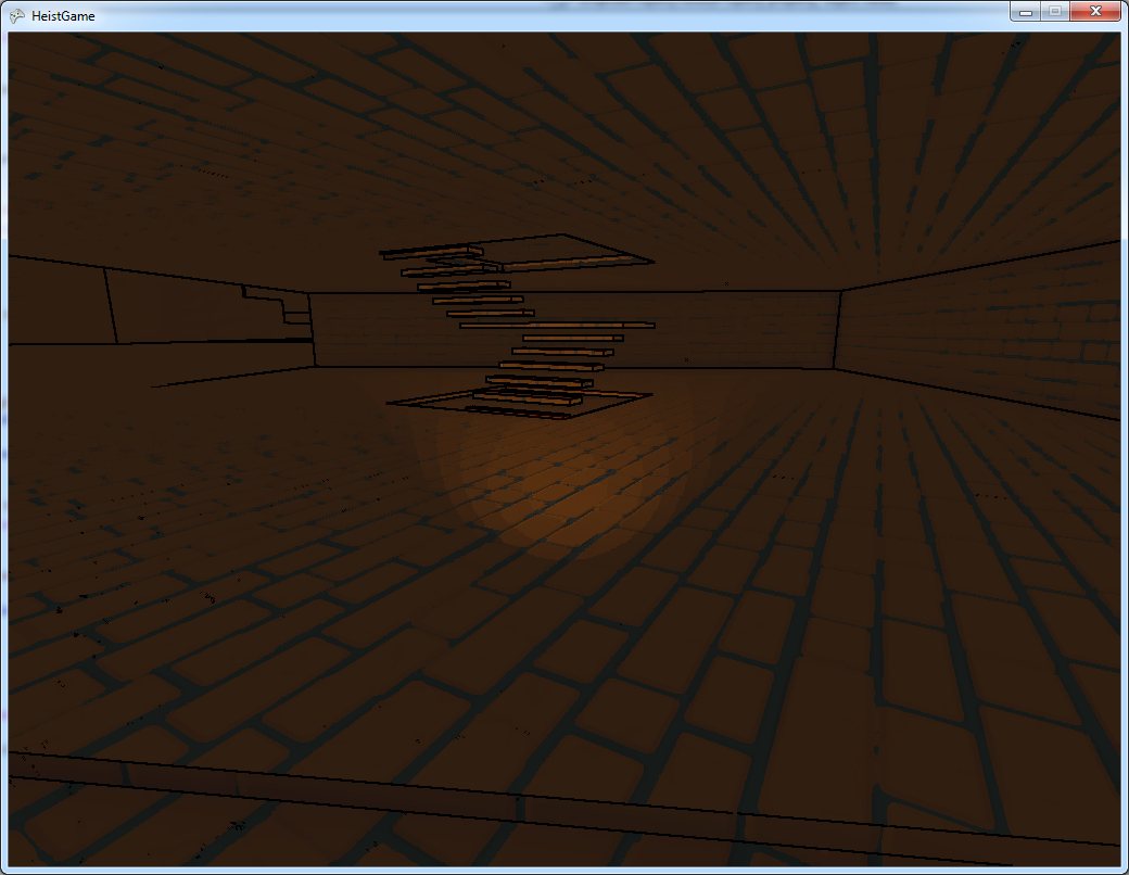
The really terrible colour banding in this picture is because the torch is absurdly dim at the moment, and I had to shift the brightness way up to see anything at all. I’ll be looking into why that is later.
Shaken, Not Stirred
The problem I have here is the game is starting to look like a conventional game but with crappier art. Actually right now that’s a pretty accurate summary of the looks! Remember back at the start I wanted to keep the minimalist look. One thing that would help with that is a more minimal texture, the brick texture is quite noisy (and incredibly ugly). Another thing that would help is a shader which automatically makes the scene a bit more stylised and minimal.
A Kuwahara filter is an effect which makes a picture look “painterly”. It does this by looking around the current pixel in little boxes, it then picks the average colour of the box with the least variance. This means you pick the colour which is defining a solid region of colour nearby, which means that you don’t lose edges - which are the details that really matter! The other great thing about this shader is it’s a constant effect in screen space, which ameans in world space it has more of an affect on far away things - it acts as a kind of depth blur which pulls the player focus in to nearby things.
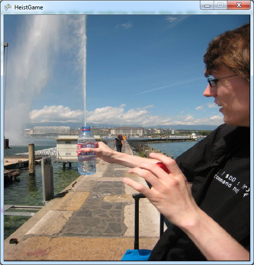
So here’s my test image:
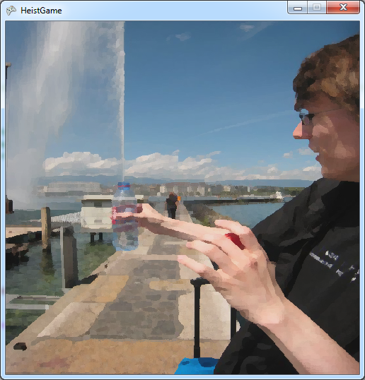
Here’s the image with the plain Kuwahara filter applied:
And here’s how I imagine using it in game, with an edge detect applied:
I haven’t shown you in game images of this filter because it wouldn’t be very useful right now, the game doesn’t have enough detail for the filter to actually change very much. Hopefully that will change once I have various different textures painted onto the world.
Next Time
I’ve still got quite a lot of work to do with graphics. Hopefully I can get a release out next week with a variety of better looking textures, a torch which puts out a bit more light than a geriatric firefly and a Kuwahara shader making it look all painterly.